08-19-2003, 12:38 PM
|
#1
|
|
A Treant
Join Date: Jul 2003
Server: Al'Kabor
Posts: 26
|
 An Idea!
Hey folks...
I'm just back to EQ after a year or so away, and this time I'm playing on my Mac.
So, I've been looking around for a UI I can bring over to that side that meets all the things I want in a UI...
But, while there are some great ones out there, they just aren't really doing the job. Most UIs I see seem very similar, at least in their general construction. They're all very boxy, and they all seem to conform to the "dashborad" look and feel.
I'm thinking about something a little more spacious... particularly in regard to the bottom of the screen!
We don't have windowed mode on the Mac yet, so even with a thin "dashboard" UI I still have to look down a lot to see what I'm attacking when it's close. And, I have to have a lot of transparency going on in order to loot or follow paths... and it makes text really hard to read...
So, I'm thinking about something with a layout like this:
CornerUI_sketch
Mind you, the lines aren't for actual/necessary shape, just for position and layout. I'd really like to know what you all think, particularly whether or not it will work. And, if there is anyone out there who might be willing to lend some assistance in helping me build it, as I really don't know as much as I should to do so (but, I'm still going to give it a shot).
Caio!
Last edited by ArkonFerat : 08-19-2003 at 04:21 PM.
|

|

|
|
08-19-2003, 03:42 PM
|
#2
|
|
A Shissar Disciple
Join Date: Aug 2002
Posts: 110
|
It's definately an interesting idea, but where are the chat windows? Most people use at least one decent size chat window, if not 2 or more. Those windows are what hogs up a lot of good screen space but they are somewhat of a necessity. Anyways, figure out where you think the chat windows would best fit and then redraw your concept. The UI layout reminds me of Quartz in a way, and also whoever made those Boots with all sorts of info crammed together and made to sit in the corners of your screen.
There's nothing wrong with creativity, so keep up the good work  |
|
|
|
|
08-19-2003, 04:15 PM
|
#3
|
|
A Treant
Join Date: Jul 2003
Server: Al'Kabor
Posts: 26
|
Eloora,
The chat windows are meant to be free floating, but will probably best orient to the top of the screen.
As such, I didn't add them into the sketch.
Thanks for the feedback...
Caio! |
|
|
|
|
08-20-2003, 12:08 AM
|
#4
|
|
An Icepaw Kobold
Join Date: Jul 2002
Posts: 80
|
It does look interesting |
|
|
|
|
08-20-2003, 10:20 AM
|
#5
|
|
A Shissar Disciple
Join Date: Aug 2002
Posts: 110
|
Ah ok i see. You'd be surprised how much the chat windows impact the whole UI, that's why I thought you should include them somewhere in your sketch. This is me spouting still lol, but I tried the whole UI at the top of the screen thing once, and it drove me nuts...but who knows it might work for others (I'm kind of a UI snob  )
Anyhoo, can't wait to see the progression! |
|
|
|
|
08-20-2003, 10:50 AM
|
#6
|
|
A Gray Wolf
Join Date: Sep 2002
Posts: 9
|
UIs at the top of the screen
I agree, Eloora. Everytime I've put anything that wasn't at least mostly transparent at the top of the screen, I catch myself ducking a little bit while I'm playing...LOL. I know that sounds wierd but when the majority of the UI isn't at the bottom of the screen I get this clostrophobic (sp?) feeling, like walking in a room with a low ceiling...maybe that's just me.
I do like the concept though.
|
|
|
|
|
08-20-2003, 12:25 PM
|
#7
|
|
A Treant
Join Date: Jul 2003
Server: Al'Kabor
Posts: 26
|
hehehehe... and here I am feeling like someone's holding a board under my chin with all of the UI at the bottom of the screen!
I'm starting to work on some graphics for this thing and I'll post some rough ups as soon as I can.
|
|
|
|
|
08-20-2003, 01:43 PM
|
#8
|
|
Quintessence of EQUI XML
Join Date: Sep 2002
Posts: 773
|
ArkonFerat, looking forward to seeing more tentative work on this; it's an interesting concept. I want to see it develop as a NEW UI; please avoid using others' graphics. If you make your own, the UI will be a nice fresh new style rather than just a rehashed t.king or Vert knockoff (which is what my UI is, humorously enough). Not that t.king or Vert or any of the other popular UIs are bad, I just think a new style'd be nice.
Eloora, you probably aren't any more of a UI snob than most people; there's no accounting for taste. I personally like a U-shaped UI (like the old old original EQ marble interface) so that's how mine's laid out (actually it's evolved into a transparent O). My best friend could care less about his UI and toys around with window positions and UI styles pretty constantly, he kinda dislikes the UIs that require windows to fit together and that need a UI file for proper placement though.
Enok
|
|
|
|
|
08-29-2003, 06:13 PM
|
#9
|
|
A Treant
Join Date: Jul 2003
Server: Al'Kabor
Posts: 26
|
First, Haliken, I so do not want to reuse other peoples art work. Some of it is very good mind you, but I am going for a completely different sensibility here. However, I am also not a "great" detail artist... so as this progresses, i will welcome assistance in spiffing things up from any ofthe VERY accomplished artisans on this site... if they are so interested.
Second, I do want to develop this as a new UI, but will be working on it from the perspective of having it used in Mac EQ, which will, unfortunately, be two releases behind PC EQ after Dungeons is out. If there is enough interest from you PC folks, I will try and keep a PC dev going as this one progresses.
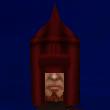
AND... without futher ado, this is what I have put together so far... CornerUI_v.01
It's only graphics at the moment, and I have tried to move away from straight lines in the corner. I thought I'd be moving faster then I am, but making final decisions on where things will go and what size they will be is more work then I thought.
CAIO! |
|
|
|
|
08-30-2003, 07:55 PM
|
#10
|
|
A Treant
Join Date: Jul 2003
Server: Al'Kabor
Posts: 26
|
Another update...
I've added positioning on the group window elements, the target elements, and the start of the player elements in the top corner.
Feedback is welcome... if anyone wants to supply some.
Corner UI v.02 |
|
|
|
|
08-31-2003, 05:26 PM
|
#11
|
|
A Treant
Join Date: Jul 2003
Server: Al'Kabor
Posts: 26
|
And, yet another version update for the holiday weekend... I mocked this graphics update over a blank screenshot to get an idea of how it would look in game.
Corner UI v.03
The files a little big...
Any feedback?
CAIO! |
|
|
|
|
08-31-2003, 10:46 PM
|
#12
|
|
A Hill Giant
Join Date: May 2003
Server: Fennin Ro
Posts: 35
|
I for one, think it is looking Damn Good! You have some very interesting concepts working here
I look forward to seeing this UI develop.
__________________
Solonis (31 Paladin)
Leohart (54 Druid)
|
|
|
|
|
09-01-2003, 01:27 AM
|
#13
|
|
A Hill Giant
Join Date: Aug 2002
Server: Zebuxxoruk
Posts: 31
|
Wow.
I'm pretty dead set in my UI, but looking at the concept all i can say is "wow" I may just have to start using that one if someone actually makes it :P
__________________
Navarro: Knowledge of this type can only be used for evil...
Irras : Be it good or evil, I will use it to reward those who oppose me...

|
|
|
|
|
09-01-2003, 02:16 AM
|
#14
|
|
A Shissar Defiler
Join Date: Aug 2002
Server: Fennin Ro
Posts: 164
|
Actually, that looks quite good! It's clean cut, and doesn't sacrifice too much as far as information. The only thing I can't figure out is where to put chat windows without sending it right back to cluttered.
This is something I've been constantly wrangling with on my own UI... the chat windows. I can't function to the best of my ability without at least 2 windows to 'partition' the tremendous amounts of info that scroll by. (As a support role class, druid, I can't afford to miss certain events)
My instinct would be to put them right above those player HP bars - right back to "dashboard" or "console" feel again. ") It seems inevitable, I can't stand text being transparent and so far haven't found 'free floating' text to be viable.
Regards,
Tellgar |
|
|
|
|
09-01-2003, 03:52 AM
|
#15
|
|
An Icepaw Kobold
Join Date: Jul 2002
Posts: 80
|
Definately gonna keep an eye on this one. I'm curious though.. the player info window, you have a 100/100 in 2 places and then the hp and mana have the percentage on them. What are these 2 separate 100/100 numbers for? I was thinking perhaps it was for a min/max hp, but then what is the 2nd one? Weight maybe? hmmm
It is looking very nice. Love the "newness" of it. |
|
|
|
| Thread Tools |
|
|
| Display Modes |
 Linear Mode Linear Mode
|
 Posting Rules
|
You may not post new threads
You may not post replies
You may not post attachments
You may not edit your posts
HTML code is Off
|
|
|
|